C H I C H I
<span data-metadata=""><span data-buffer="">Online Grocery Store
My Role: Visuals, Interaction
Duration: 4 month
Deliverables: Mobile app
Overview
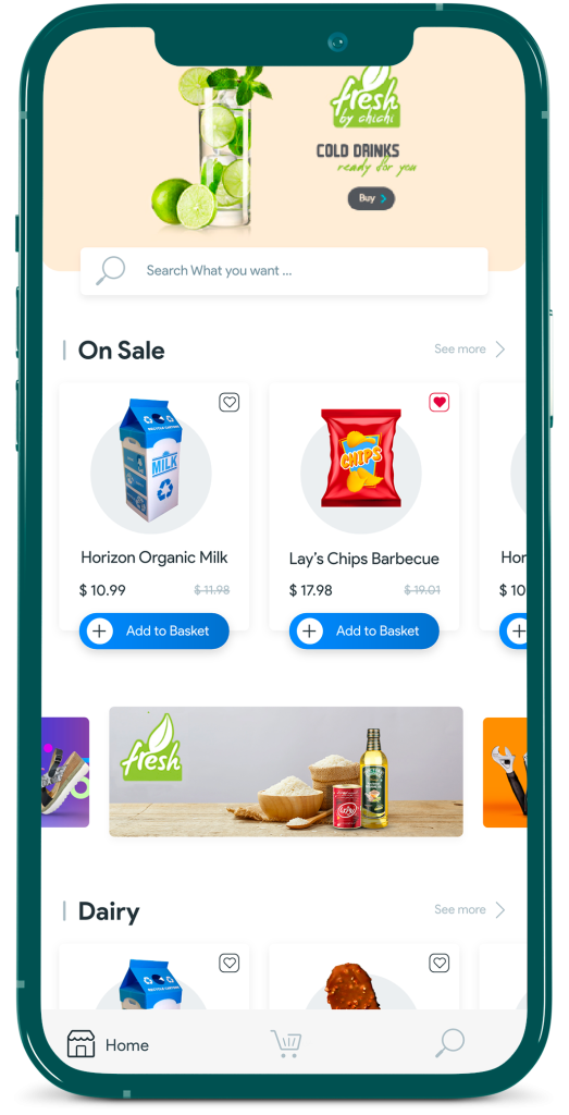
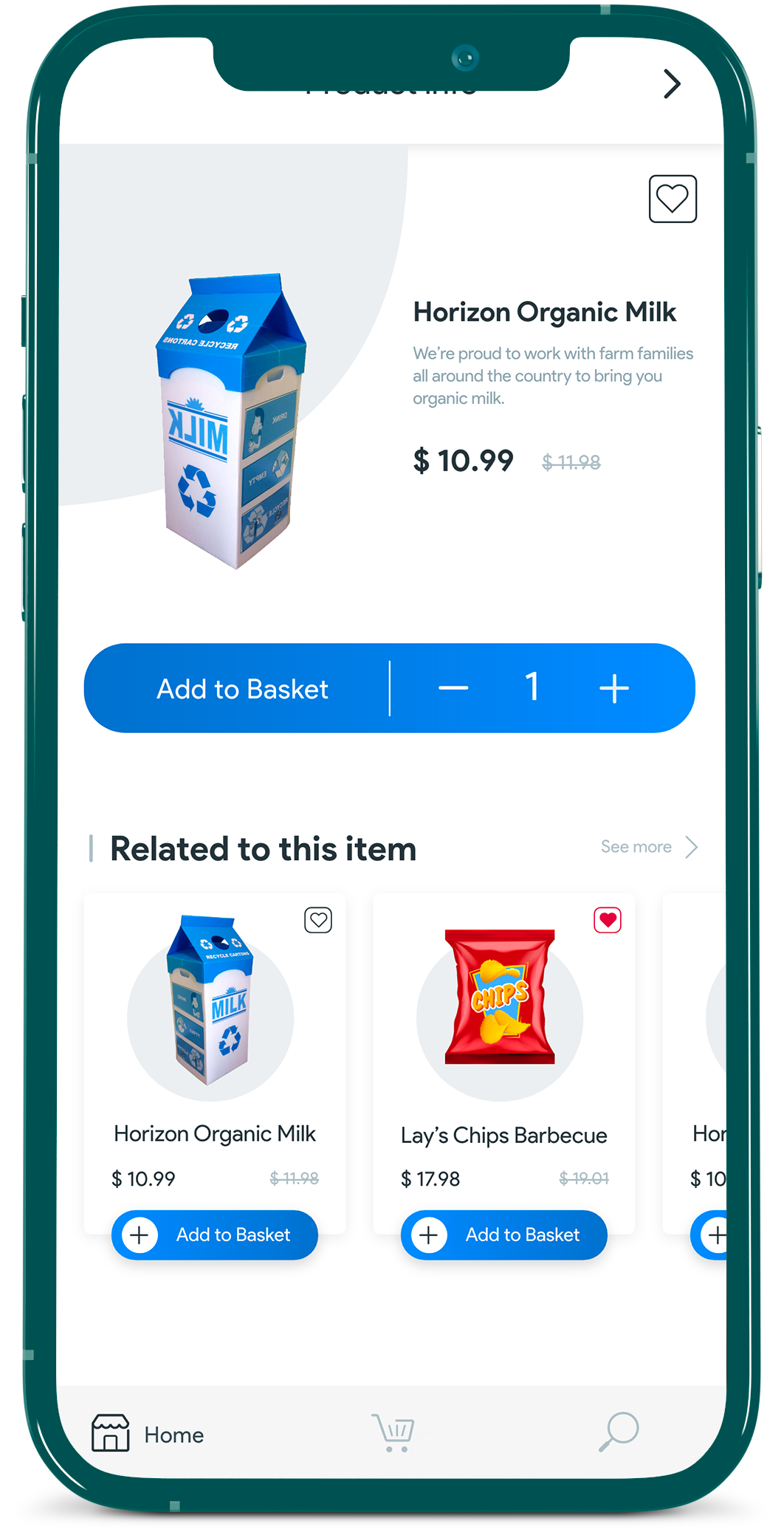
Chichi is an online grocery shopping Service for buying household necessities and other stuffs.
This service included two products: a store app and an couriers app.in this case study, I want to talk about the store app.( you can read about the courier app at this link.)
my role in the store app was mostly in the direction of ideation, prototype, and evaluation ( Based on data collected from users and project investors) , because I joined the team in the middle of the project and after the research and definition stages.
Missons & Challenges
<span data-metadata=""><span data-buffer="">Start Point - Roadmap
Rako is a tennis platform that specializes in tennis. This app allows users to book tennis courts online, book and select tennis coaches to learn from, and shop for tennis equipment. The application was created initially to allow online tennis court bookings, but as it developed and became more popular, other features were added.
as a product designer, I took part in all phases of the design process, from understanding users to producing a high-fidelity prototype to convert business goals into a useful and usable product for users based on the product roadmap.
<span data-metadata=""><span data-buffer=""><span data-metadata=""><span data-buffer="">Who are we designing for?
For customers who are looking for an easy and hassle-free way to shop for groceries online.
<span data-metadata=""><span data-metadata=""><span data-buffer="">What is the ultimate goal?
<span data-metadata=""><span data-buffer="">Creating a seamless grocery shopping experience by improving the overall process.
<span data-metadata=""><span data-metadata=""><span data-buffer="">When will the solution prove useful?
<span data-metadata=""><span data-buffer="">In the first step, when we reached a suitable percentage of CSAT ( User Satisfaction )after the usability test.
<span data-metadata=""><span data-metadata=""><span data-buffer="">Where do we need to focus most?
Creating an attractive, attention-grabbing, and user-friendly interface that solves user problems.
<span data-metadata=""><span data-metadata=""><span data-buffer="">Why is it important to solve this problem?
<span data-metadata=""><span data-buffer="">reducing the time and mental and physical effort required to do grocery shopping, as well as easily comparing the price ranges and various product offerings.
<span data-metadata=""><span data-buffer="">Primary Research Insights
We decided to get some quantitative data from our suppliers to learn more about users’ behavior and buying habits since our products were supplied by two stores in our city at the first step. Following is a summary of the results
Competitive Analysis
A competitor analysis was performed to establish a solid foundation for ChiChi ( list of 4 competitors)
My evaluation identified several features Chichi could use to gain an advantage over competing products.
This case study will not reveal the data collected on them, but it did provide insights like:
- Only one of the four main competitors allows users to create order lists for their next purchases, but it is still not ideal.
- Additionally, only two of them offer recommendations
<span data-buffer="">Preliminary Ideation<span data-metadata="">
Create a User Flow
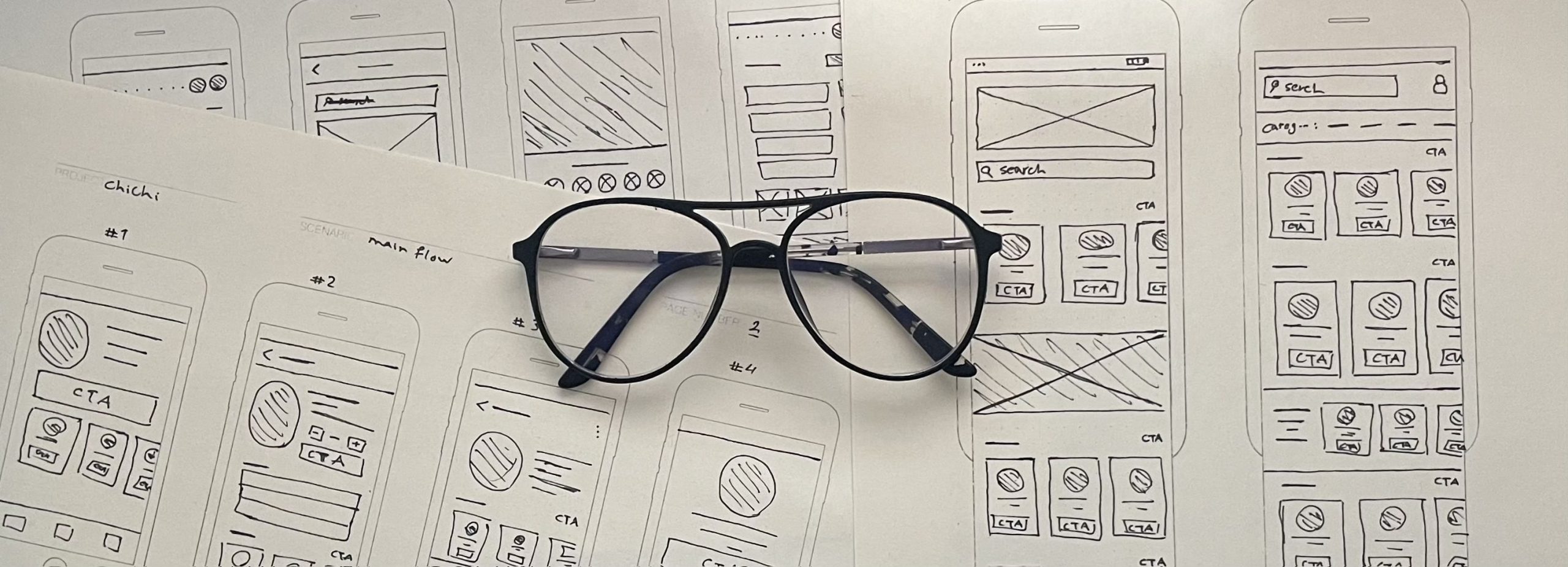
After successive reviews of data and ideas and their priorities, and repeating different user journeys and different scenarios, we reached a consensus on a path, and then to better understand how to build the core experience, we designed a user flow.In this way, we were able to focus more on the user’s experience and needs and less on the details that we would have to nail later on. Furthermore, it provided us with a better understanding of the entries and exits going forward.
Wireframing
By creating a higher fidelity but still relatively primitive version of our wireframes, we were able to solve some of the technical issues that weren’t applicable to ChiChi, and also prepare the product for usability testing

Final Design
1.Intro Guide
Basic explanations about Chi Chi with illustrations with elements specific to the city of Sari
2.OTP Login ( or Signup)
The login and OTP are designed in such a way that by entering any number by the user, the illustration on the page will be animated according to the same number (Smart Animate).
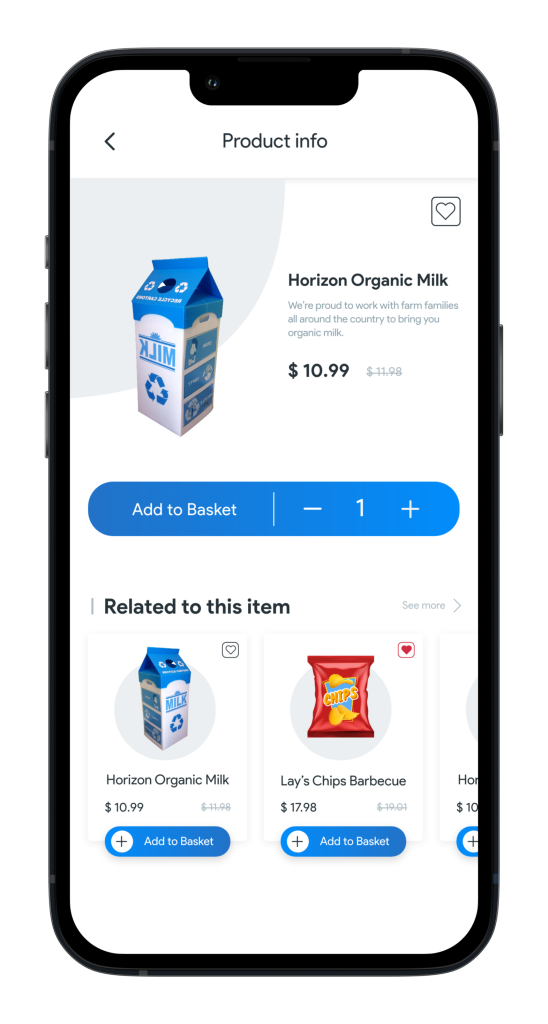
3.[Quick]Add to Basket
adding to the Basket is done both quickly and in a detailed way and by viewing the product, and in both of them there is an attractive micro interaction for entering the product into Basket. ( Aniamted in Aftereffects and exported as a JSON)
4.Navigation Drawer
5.Product info
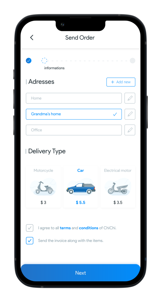
6.Order Delivery
- Style Guide
- Project illustration
Takeaway
After successive reviews of data and ideas and their priorities, and repeating different user journeys and different scenarios, we reached a consensus on a path, and then to better understand how to build the core experience, we designed a user flow.In this way, we were able to focus more on the user’s experience and needs and less on the details that we would have to nail later on. Furthermore, it provided us with a better understanding of the entries and exits going forward.
Related Project:
ChiChi-man app
ChiChi online Supermarket • 2018
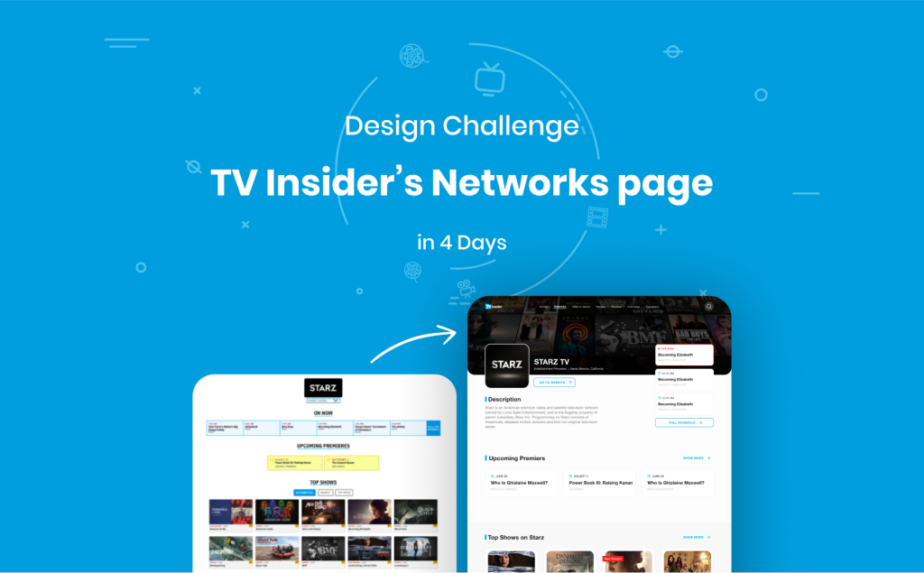
“TV Insider” is a convenient guide to TV channels and their shows on the website.I have attempted to explain briefly the 4-day process I went through for redesigning the Network Section of the“TV Insider” website.