D I G I P A Y
<span data-buffer="">Electrical Equipment and Health Insurance<span data-metadata="">
My Role: Product Design
Duration: 2 – 3 months
Deliverables: Mobile app, PWA, Web, Service
Contributor: Ramyar Rezaei, Arya Kazemi
Overview
Due to the complex and sensitive nature of insurance processes and laws (which creates many sensitivities for both users and insurance companies), our greatest challenge in the discovery phase was to understand the nature of the insurance product so we could have a comprehensive view of the relationship to design a product that is clear and understandable for users in general and details of insurance. After several meetings with the business team and insurance companies, we were able to design an acceptable MVP product that meets most of the business and user needs.
My role in this project, as a product designer and service designer, was to advance the entire design process (from discovery to prototype and testing) in the design process, in cooperation with the design team and the business team. As a result, we will create a roadmap that aims to achieve all the business goals for the insurance product and service.
Due to the NDA contract, most parts of the process have been stated in a brief form, or due to the confidentiality of the information of some parts, fake data has been replaced.
Missons & Challenges
Let's Start with Personalizing a design process
At the suggestion of our design team leader Arya, since my colleague and I had experience using several Design Process methods, it was decided to use a new process to challenge ourselves and also to get a broader perspective on the product. Additionally, by analyzing this design process, we can combine different methods and optimize a new method for use across the entire organization and for other product lines.
Thus, we used Namahn Service Design for this project. Considering that we intended to design a product, it was necessary to go beyond the general concept of service design and dive deeper. Hence, we personalized Namahn for some parts to make it more efficient for us (such as prototypes and journey maps.)
First - Framing The Project
The first step was to collect all the material and information that will form the foundation for the organization’s strategy. a meeting was held to get all interested parties around the table. By scoping the project and strategy together, we ensured that all the interested parties have the same understanding and begin from the same starting point.
in other word, we wanted to build the frame of a big picture.
vision, target group, competitors, positioning, business plan, brand and values was some of those things that got answered in this meeting. you can see a brief of the meeting result
we made assumptions about the market and the needs of users in the first step.
So in the next step of framing, we wanted to identify what we want to know or verify about our (potential) users and who they are.
For this, we separated all the things we knew and all the things we wanted to know, and then, by identifying the main groups of users and stakeholders, we categorized the basic questions to be answered by interviewing them.
After this, we started defining a scenario and a general framework and process for asking our questions to conduct semi-structured interviews with users.
Next: Meet The User
So we spoke with the users and gathered their insights about their current experience( before the implementation of our product ). we divided the user insights into 6 phases and tracked user feeling at each phase and identifying the reasons. as a result, we draw a diagram of user satisfaction with the current flow for buy and use insurance services based on the insight.
The point that was very interesting for me in these interviews was that we assumed that the user, having knowledge of various types of insurance, researches medical insurance or electronic equipment and buys insurance. While from the interviews, it was concluded that 80% of the interviewed users had no knowledge even about the types of insurance and sometimes they considered them the same.
- Actors map and Persona Dimensions
Following the identification of the user insight and for the definition of the persona, based on the conducted interviews, we proceeded to define an actor map for the overall arrangement of different actors in each phase, as well as detailing the personal characteristics that influence our product ( Persona Dimensions) to meet the different needs and expectations of the target groups as closely as possible .
We reached a preliminary conclusion based on the interviews and the persona dimension (by engaging with the marketing and support teams), which was interesting. we found that we can divide users into two main categories:
1- Middle-aged and elderly users who have sufficient insurance literacy but do not have acceptable technology literacy.
2- Young users who have low insurance literacy but have good technical knowledge
and Now it was the time to define our Personas
- Persona
Personas are fictitious users of the service.we started from the characteristics that we detailed on the persona dimensions template. As far as possible, we based the personas on factual knowledge and insights from the interviews.
Step3 : Let's Talk about Design Scope
in the design scope step, we re-formulated the initial question based on all the insights that we have gathered from inside and outside the organization. actually, this is the last step of Problem definition. On the first sheet, we decided where we want to focus and write what we wish to design in a sing clear sentence. then we broke the sentence into three parts ( Who, Does What, and Why) to determine the high-level requirements that we should answer by our design. By defining the problems correctly, we were able to find innovative solutions.
In brief, We achieved the following eight requirements: Transparency, ease of use, learnability, accessibility, Suitable price, claiming usability, various coverage categories, speed in registration, and claiming.
Ideation in "Lotus Blossom" Way
I can boldly say that one of my best experiences in the ideation phase of a product was using this method. the “lotus Blossom” help you find ideas by means of fragmentation and association.
we planned an idea workshop and invited our PO, Business Team, and development team. we had given them the context ( results of previous steps) before the meeting.
in the workshop, for each requirement, we used an inspirational example and combined the best characteristics of the examples into product solution ideas. as you can see, here are two of these ideation boxes that we reached.
at the end of the workshop, we use a common way to select ideas called COCD.we selected ideas based on originality and feasibility and We divided them into 4 groups:
- The first group ( red group )is those ideas that are not only not original, but also not feasible at the moment, so they are ideas that should be forgotten.
- The Green one is those ideas that are not original but feasible, so we put them as standard features of our product.
- The Blue Group is our main group that has both originality and feasibility. these ideas will make difference and be our competitive advantage.
- and the last group with ideas that have originality but are not (yet) feasible. we parked them to develop them later.
Service Concept - Scenarios
After completing the ideation stage, it was time to start the wireframing and prototyping process. before starting, we tried to map what we want in different ways.
Methods such asThinking up future scenarios by means of “serious play”, conducting journey maps for an overview of the future service from the standpoint of all the users and employees, information architecture, user and process flows, etc
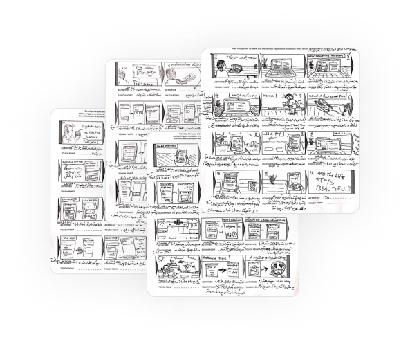
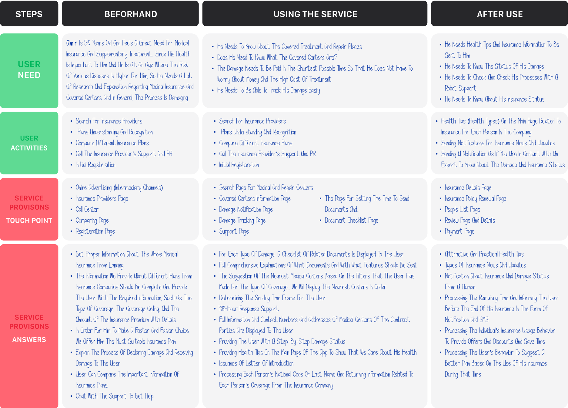

P.S: In this case study, my primary goal was to depict the design process in the style of Namahn which is how we reached a solution ( as we saw in previous sections), so I put a brief overview of the work here. So accept my apology for the unclear images in this section :)))
Final Steps: Prototype,Blueprint and Roadmap
After going through all the steps, now it’s time for us to implement all this information in the form of the user interface. In this section, you can see the result of this process.
NOTE: In this section, we designed all the items in COCD that were in the green and blue boxes (standard ideas and ideas that make a difference), but in the final phase of our design service, we divided these designs into MVP and pilot. as a result, you can see some parts of the design below:
Registeration
In the registration phase, we used a recommendation system by a character for Digipay insurance called Digibot, so that with the fewest possible questions, the user can register as quickly as possible, while finding the right company and plan.

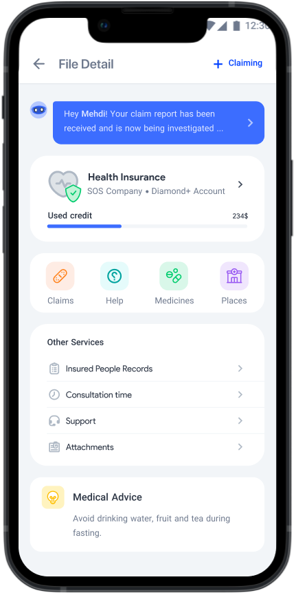
Insurance Policy Detail ( File Detail )
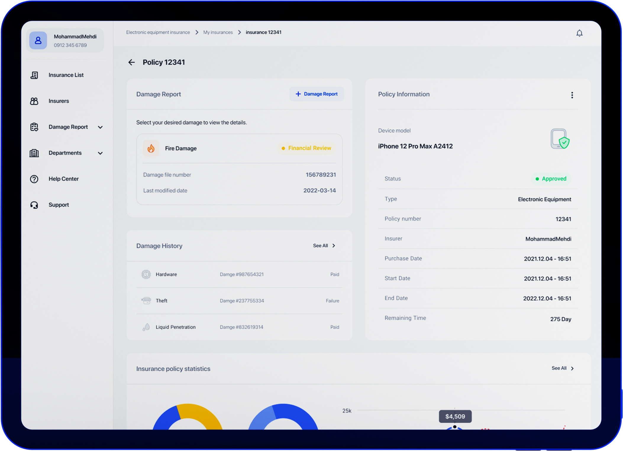
We have a main page in the DigiPay insurance panel that displays all the insurances purchased by the user… so to see the details of each insurance, click on it and you will reach the above pages, which include complete information and main actions. (including claiming and its follow-up)
Caliming
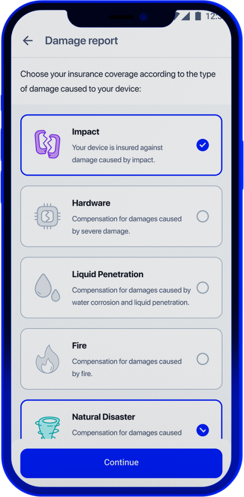
Damage Claiming is done with a very clear and simple flow… If physical documents are needed, in the MVP version, we will specify a time to send a courier to receive the documents through the call center contact with the user.
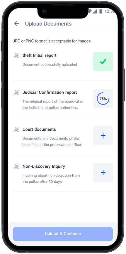
Claiming - Upload
But if there is a need to submit documents online (e.g to theft Coverage) the user will be redirected to the document upload page.
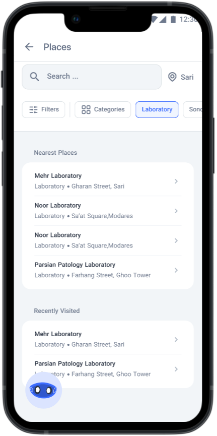
Places
To refer to the places covered by the insurance, by referring to the places page, the user can reach the right place as soon as possible with a filter based on his/her needs and have its contact and location information.

Digibot
The Digibot not only rushes to help the user at the registration stage, but at any stage and at any time, the user can benefit from Digibot’s assistance.
Takeaway
Namahn’s design process is one of the most effective tools for solving complex problems. Knowing this, by personalizing this method and adding and subtracting some parts, with frequent meetings with users and stakeholders, we reached a comprehensive and complete view of the complex issue of insurance (in the field of treatment and electronic equipment), and By providing and implementing appropriate solutions, turn this product into one of the most popular DigiPay products among customers, especially Digikala customers.
Related Project:
Digipay Social Score (DP Score)
Digipay • 2022 -23
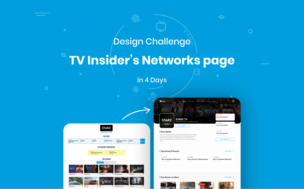
“TV Insider” is a convenient guide to TV channels and their shows on the website.I have attempted to explain briefly the 4-day process I went through for redesigning the Network Section of the“TV Insider” website.

C-Credit Usability Testing
Digipay • 2022
“TV Insider” is a convenient guide to TV channels and their shows on the website.I have attempted to explain briefly the 4-day process I went through for redesigning the Network Section of the“TV Insider” website.