R A K O
<span data-metadata=""><span data-buffer="">online tennis court booking Application
My Role: Product Design, from Research to Test
Duration: 6 months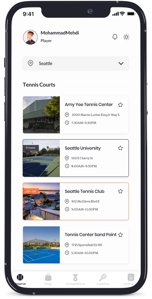
Overview
Overview
Rako is a tennis platform that specializes in tennis. This app allows users to book tennis courts online, book and select tennis coaches to learn from, and shop for tennis equipment. The application was created initially to allow online tennis court bookings, but as it developed and became more popular, other features were added.
as a product designer, I took part in all phases of the design process, from understanding users to producing a high-fidelity prototype to convert business goals into a useful and usable product for users based on the product roadmap.
Missons & Challenges
1) Design a mobile app that allows users to book a tennis court without having to call the club directly and be able to find new players to play with.
2) Design a simple and easy-to-use dashboard for club owners to manage Bookings and finances (Accessibility was a major concern.)
3) Quickly prototype a key flow of the app.
4) develop a luxury visual identity to accompany it.The Beginning Whistle
At Rako, we followed a goal-directed design approach to create an effective tennis platform. Our research process involved qualitative research methods such as a Onboarding meeting, competitive analysis, stakeholder interviews and persona hypothesis construction. By aligning on project goals and understanding user needs, we started to create a platform that is user-friendly and intuitive. We asked ourselves initial key questions such as the problem we were solving, user profiles, goals, and pain points to establish a clear understanding of the project goals and user needs. Our research process helped us create a user-centered platform that meets the needs and goals of our users.

Competitive Analysis
As the sports ground booking system was new in our country, we had to broaden our search to similar applications worldwide. After analyzing several products, we found many had complicated flows and unsuitable user experiences, leading us to analyze products in different markets. Our analysis included a review of their product offerings, booking flow, marketing strategies, and user experiences. We identified our key differentiators as our specialized focus on different sides of tennis, comprehensive feature set, and user-friendly interface. We also found room for improvement in competitors’ user experiences and customer acquisition/retention. In addition to products in the same market, we focused on rules of booking and user experience, collecting data in a Google Doc file.
Meet The User
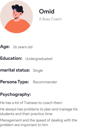
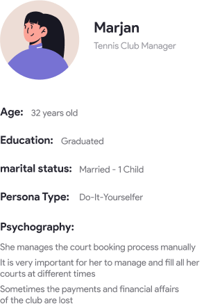
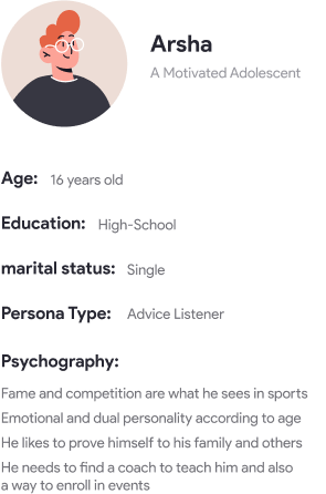
Interviews with users were conducted after the mentioned initial steps and brought very useful data. including the main user personas:
The (First) Design Sprint
Data has been collected, now it was time to get a suitable solution by putting the data together as soon as possible,
that’s why we run a “Design Sprint” which was the most suitable approach for our goal.
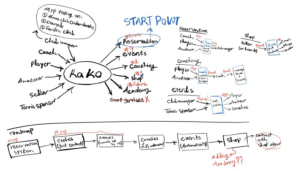
Day1 - Map the Data and getting the team on the same page
We started the design sprint by bringing together all the data we had collected, analyzing the current processes, and ensuring that everyone on the team had a clear understanding of the project’s goals. Through surveys of competitors in the same market, user interviews, and stakeholder discussions, we gained a comprehensive overview of the product’s key parts and features. Based on this information, we reached a consensus that the focus of this sprint would be on developing a booking system solution that encompassed everything from finding suitable clubs to tracking reservations.
Day2 - ideate and Decide
Morning: Review the findings from Day 1 and ideate on possible solutions to the identified challenges. Use techniques such as brainstorming and “How Might We” questions to generate ideas.
- Review the findings from Day 1 and use them as a basis for generating ideas for potential solutions.
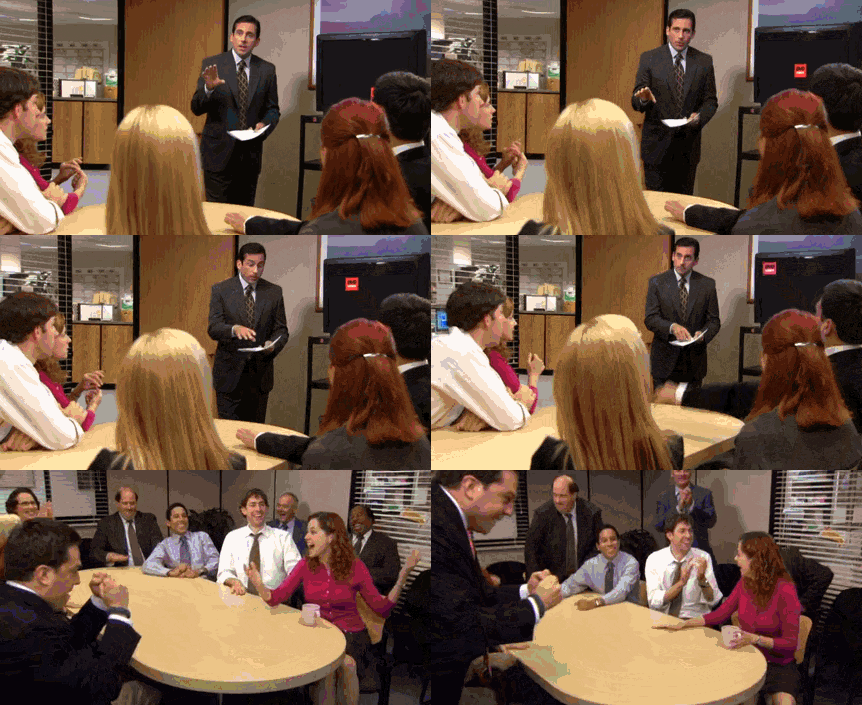
- our approach to generating ideas was to spend 1 hour of the first half of the meeting in such a way that each of the members ideates ( and write/sketch the ideas) alone, but we should do it together at the same time as a group
- Review the potential solutions generated in the morning and select the most promising ideas.
- we , combined some ideas together and also changed them to reach the best solutions
Day3 - Prototype
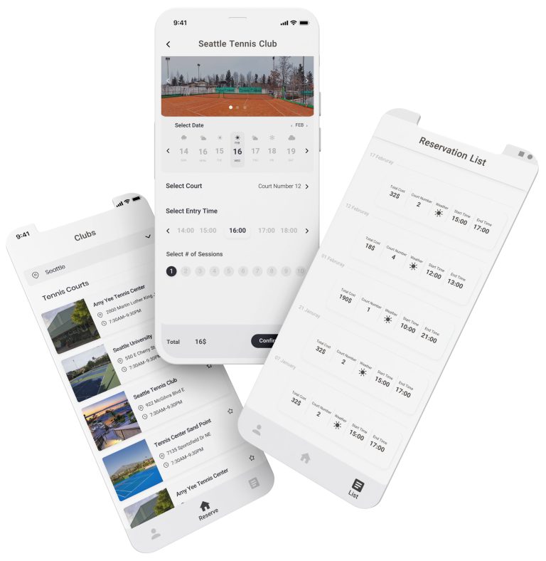
On day 3 of the design sprint, we developed low-fidelity prototypes using Sketch and Protopie. The prototypes included wireframes for the home page, court booking page, payment process, and booking list page. they were not designed pixel-perfect but were functional enough to give users a sense of how the solution works.
In light of the COVID-19 pandemic, we conducted usability tests with users remotely since in-person testing wasn’t feasible. We arranged virtual meetings with approximately 12 users to gather feedback and insights. but first,(before usability testing) we tested the prototype internally to identify any usability or functionality issues and make any necessary adjustments.
Day4 -Test with the users
Conduct usability testing on the prototypes created on Day 3. Gather feedback from users, focusing on the ease of use, Time efficiency, clarity of information, and overall user experience.
- We defined a scenario, and based on that scenario, we arranged tasks and for the end of the test, we considered a survey with 10 four-choice questions in order to record the opinion of the test users.
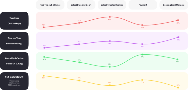
- We determined four metrics for the measurement : Task Error, Time Per Task, Overall Satisfaction ( based on survey), Self-explanatory UI
- Also we gathered All Qualitative feedbacks to analyse them later
After conducting usability tests and analyzing the feedback, we found that the overall user satisfaction with the booking flow was decent, but there were several issues that needed to be addressed. The main problem was with the booking page, particularly the selection of arrival time and the number of sessions, which caused confusion for many users. Additionally, the size of the time and session buttons on this page was inadequate, resulting in a high incidence of misclicks.
Another significant issue was that users had difficulty locating the option to cancel their reservation on the reservation list page. These were the primary pain points that emerged from the usability testing.

Day5 - Urgent Planning
On Day 5, we analyzed the feedback we received from the usability tests and categorized it based on priority and impact. This helped us determine if we needed to conduct another sprint to address the issues.
After careful consideration, we concluded that the feedback we received highlighted a significant need for a major overhaul of our design, especially on the booking page. While a full design sprint may not be necessary, we decided to conduct a follow-up sprint to focus on resolving these critical issues and improving the user experience.
The Follow-up Design Sprint
Follow-up sprint was conducted in 3 days: Ideate,Prototype and Test.in this sprint we tried to resolve the critical issues recieved from usability testing and improve the user experience.
Here is the result of the follow-up design sprint after re-doing the usability test:
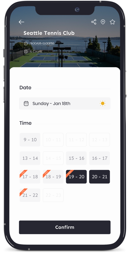
Significant changes have been made to the reservation page, particularly in resolving numerous issues related to time selection.
The redesign has also streamlined the page’s layout, making it more user-friendly and less confusing
We have improved the design of the reservation list page by addressing the issue of users not being able to find the cancel reservation button
and adding new ideas to some sections related to reservations, such as editing the time. In the previous version,
users provided feedback that they were unable to locate the cancel reservation button.
Some Other Screens of Final Product
Over time, features were added to the app and some pages underwent very minor changes,
here is the latest version of some pages that I designed:
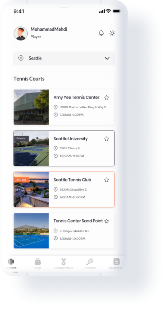
1. Home Page ( Clubs)
The main page contains clubs, filters for them, and information badges such as private clubs and discounts.
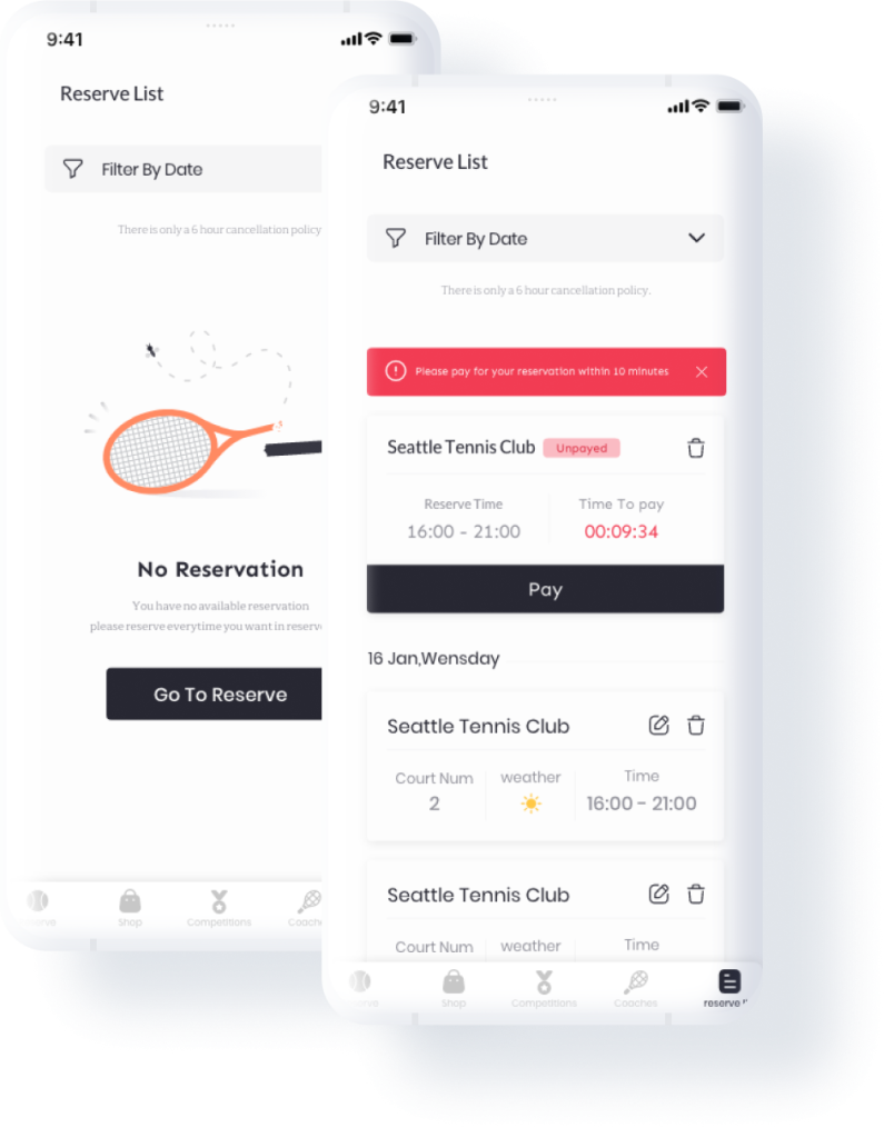
2. Reservations List
The list of reservations underwent changes for Online Payment. Empty state has also been added
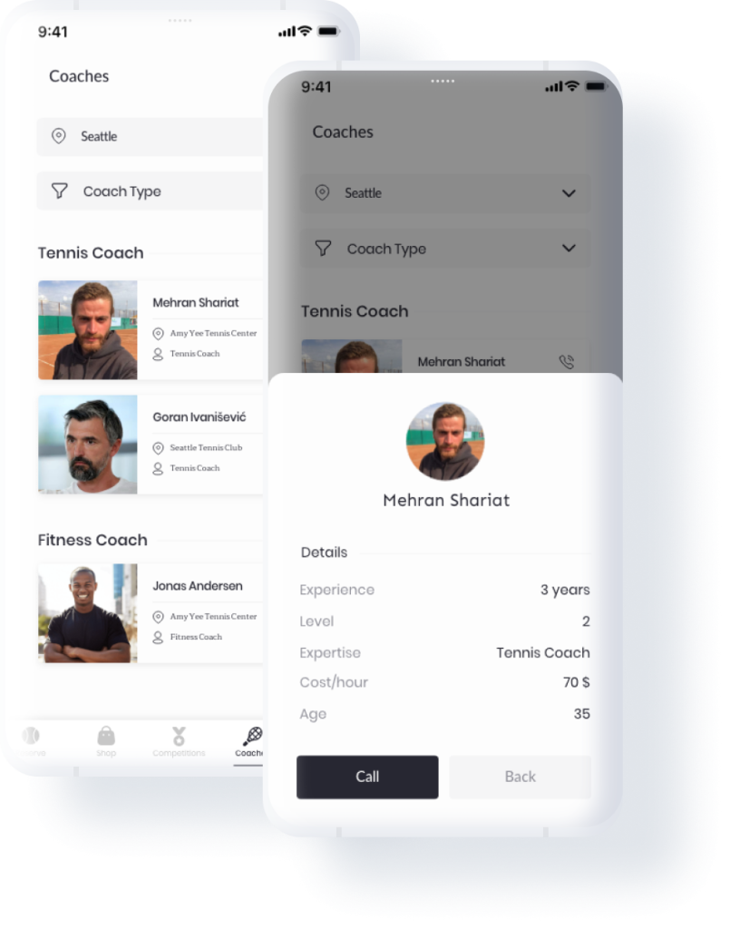
3. Coaches
The list of coaches that includes two filters, training city and coach’s training type.(bodybuilding, tennis training ,etc.)
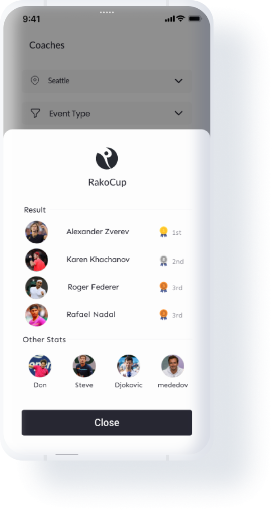
4. Events(Results Modal)
The events in their first version are manually set by our support team and the results of the matches can also be seen.
StyleGuide - Luxury and Active
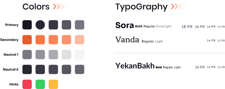
We created a style guide for Rako that reflects both luxury and minimalism while also conveying a sense of sporty vibrancy. This was the result of extensive research and consideration of various opinions. The style guide serves as a foundation for consistent visual design across all Rako products and helps maintain a cohesive brand identity. It includes guidelines for typography, color, imagery, and layout, as well as examples of how to use these elements in different contexts. The guide ensures that all design decisions align with the overall vision and goals for the brand.
Takeaway
We created a style guide for Rako that reflects both luxury and minimalism while also conveying a sense of sporty vibrancy. This was the result of extensive research and consideration of various opinions. The style guide serves as a foundation for consistent visual design across all Rako products and helps maintain a cohesive brand identity. It includes guidelines for typography, color, imagery, and layout, as well as examples of how to use these elements in different contexts. The guide ensures that all design decisions align with the overall vision and goals for the brand.